About us
4/11/2023 8:39:03 AM
CORE VALUE SYSTEM
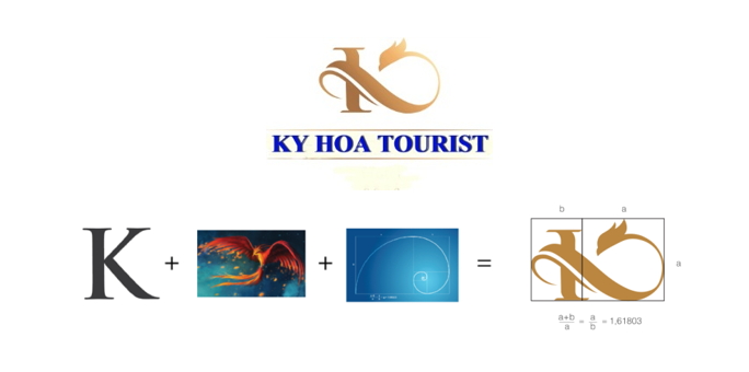
- Brand identity through our logo:

+ The meaning: The logo is stylized from the majestic Phoenix, an immortal bird, which represents all species. It is a symbol of the yin-yang harmony, growth and prosperity. The combination of the Phoenix and the letter “K” from Ky Hoa is based on the golden ratio of design, forming a creative symbol with high definition of feng shui.
+ The colors: Yellow gold and dark moss green are mainly used in the logo, both express elegance and reliability, bringing friendliness and close to nature.
+ The font: By using serif font, the logo brings solidity and sophistication, which is harmoniously combined with the symbol.
- Slogan:
Aim at Perfection Always
- Vision:
Our ambition is to become a business unit in the field of accommodation, cuisine and tourism with a high valuable brand, gaining lots of sympathy and trust not only from domestic customers but also foreign customers by the hospitality and professionalism.